No products in the cart.

Discover the most effective and stylish cover design trends to make your fiction book stand out and attract readers.
The cover of a book is its silent salesperson, and for fiction, this first impression is critical. Before a potential reader even scans the blurb, the cover communicates the novel's genre, tone, and atmosphere. Each literary genre has developed a distinct visual shorthand—a set of unwritten rules and expectations that readers subconsciously recognize. A cover that aligns with these conventions acts as an immediate signal, attracting the target audience while filtering out readers who are not a good fit. For instance, a stark, minimalist cover with elegant typography suggests literary fiction, signaling a focus on character and prose. In contrast, a cover featuring a spaceship and nebula instantly communicates science fiction. Mastering this visual language is the first step in genre-specific design. It involves researching bestsellers in your category, identifying recurring motifs, and understanding the emotional response certain colors and imagery evoke. This foundational knowledge ensures your cover speaks directly to the readers most likely to connect with your story.
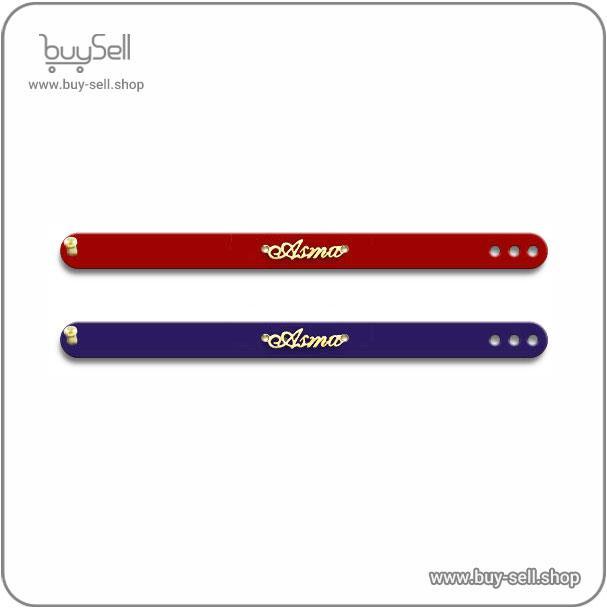
Product purchase offer : Bracelet and accessory pattern
Applying core design principles differently for each genre is what makes a cover effective. For romance novels, the cover must convey emotion and connection. This often involves warm, inviting color palettes like rich reds, soft pinks, and golds. Imagery tends to focus on couples or symbolic elements like a lone flower or a picturesque landscape, with cursive, flowing typography enhancing the feeling of intimacy and passion. In the thriller and mystery genres, the goal is to create tension and intrigue. Designers achieve this through high-contrast color schemes, often using dark blues, blacks, and stark whites. Imagery might be cryptic—a silhouette, a key, a blurred figure—to provoke questions. Typography is typically bold, sharp, and impactful, sometimes with a distressed effect to suggest danger or a gritty narrative. Fantasy covers, on the other hand, demand a sense of scale and wonder. They frequently showcase epic landscapes, intricate magical symbols, or detailed character illustrations. The color palette can be vast, from the earthy tones of a medieval setting to the vibrant hues of a magical realm. The typography is often ornate and custom-designed to reflect the world within the book, helping to transport the reader before they even turn the first page.
Product purchase offer: leather keychain patterns

Beyond imagery, typography and color are the most powerful tools in a cover designer's arsenal, deeply rooted in psychological principles. The font chosen for the title and author name is not merely a functional element; it is a critical part of the storytelling. A classic serif font like Garamond or Baskerville conveys tradition, authority, and elegance, making it a common choice for historical fiction or literary works. A sleek, modern sans-serif font like Helvetica or Futura suggests contemporaneity and is well-suited for modern thrillers or contemporary fiction. For horror, jagged, irregular, or dripping fonts can instantly evoke a sense of fear and unease. Similarly, color psychology plays a direct role in setting the mood. Cool colors like blue and green are often associated with calmness or sadness but can also denote technological or cold, eerie settings in sci-fi and horror. Warm colors like red and orange evoke passion, energy, and danger. Yellow can signal happiness or, in a different context, caution and decay. Understanding these subtle cues allows a designer to reinforce the genre's themes intentionally, ensuring every element on the cover works in harmony to tell a compelling visual story.

While it is important to adhere to genre conventions, a cover must also stand out on a crowded digital bookshelf. This requires a delicate balance between being trend-aware and creating a timeless design. Cover trends can be influential; for example, the recent popularity of simplified, iconic covers in contemporary romance or the use of bold, graphic art in upmarket fiction. Incorporating a trendy element can make a book feel current and relevant. However, leaning too heavily on a fleeting trend can date a book quickly, causing it to look obsolete within a few years. The goal is to use trends as a subtle accent rather than the foundation of the design. A timeless cover focuses on strong, classic composition, legible typography, and a core concept that accurately reflects the soul of the story. It should feel familiar enough to signal its genre but unique enough to be memorable. Ultimately, the most successful genre-specific covers are those that resonate emotionally, compelling a reader to pick up the book and discover the world inside.

May 04, 2025

Apr 28, 2025

Apr 20, 2025
Apr 23, 2025

Oct 25, 2025

Subscribe to the Buy Sell newsletter and enjoy its benefits.