No products in the cart.

Learn how to use color theory to choose the perfect leather for your bookbinding projects and create visually stunning, professional-looking covers.
Color psychology is the study of how different hues affect human perception, emotion, and behavior. In the realm of design, this is not merely about aesthetics; it is a powerful tool for communication. Every color evokes a subconscious response, and understanding these associations allows designers to create more effective and impactful work. This principle is universal, applying to everything from a brand's logo and website to product packaging and interior spaces. The goal is to align the color palette with the intended message and the emotional response you wish to elicit from your audience. For instance, a color that signifies trust and security in one culture might convey a different meaning in another, making cultural context a critical consideration.
The effects of color are rooted in both biological responses and learned cultural associations. Biologically, certain wavelengths of light can physically impact us—red can increase heart rate and metabolism, while blue can have a calming effect. Culturally, we learn that red means "stop" and green means "go," or that white is for weddings in some societies and for mourning in others. A successful designer synthesizes these innate and learned responses to choose a color scheme that resonates with the target audience and supports the design's primary objective, whether it's to excite, soothe, persuade, or inform.
While individual experiences can vary, broad psychological associations for colors have been established through extensive research. These associations provide a foundational guide for designers. Here is a breakdown of some primary colors and their common connotations:
Knowing the theory is one thing; applying it effectively is another. The practical application of color psychology involves more than picking a single hue. Designers must consider combinations, contrast, saturation, and context. A color's meaning can shift dramatically based on the colors it is paired with. For example, a vibrant orange might feel playful next to white, but more subdued and earthy when combined with dark green. The concept of color harmony—using complementary, analogous, or triadic schemes—is crucial for creating a visually pleasing and psychologically coherent palette.
Context is paramount. The same shade of blue used for a social media app (suggesting communication and connectivity) would be applied differently for a corporate law firm (suggesting trust and authority). Furthermore, the target audience's demographics, such as age, gender, and cultural background, will influence color perception. A design aimed at children might use bright, primary colors, while one targeting an older, more conservative audience might opt for muted, traditional tones. A/B testing different color schemes on websites or marketing materials is a common method to empirically determine which palette resonates best and drives the desired user action, be it a click, a sign-up, or a purchase.
Even with a solid understanding of color theory, designers can fall into traps that undermine their work. One frequent mistake is ignoring cultural differences. A color strategy that works in North America may fail or even offend in Asia or the Middle East. Thorough research into the cultural symbolism of color in your target market is non-negotiable for global brands. Another error is overcomplicating the palette. Using too many colors can create visual chaos, dilute the message, and weaken brand recognition. A limited palette, often based on a primary brand color and one or two accents, is typically more effective.
Neglecting accessibility is a critical oversight. Design must be inclusive, and color choices should provide sufficient contrast so that text is readable for users with visual impairments, including color blindness. A beautiful color scheme is ineffective if the content is inaccessible. Finally, a common pitfall is following trends blindly. While it's important to stay current, a color scheme should be timeless enough to ensure the design has longevity and remains authentic to the brand's core identity, rather than appearing dated a year later.
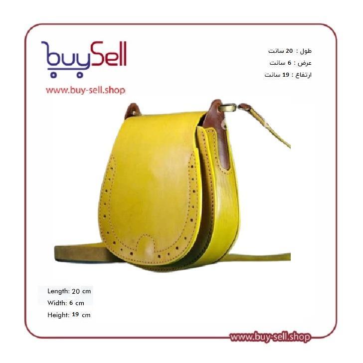
Product purchase offer: leather bag pattern
In conclusion, color psychology is far more than a decorative element in design; it is a fundamental component of strategic communication. By understanding the emotional and psychological weight of different hues, designers can make intentional choices that enhance user experience, reinforce brand messaging, and guide audience behavior. The most successful designs are those that use color thoughtfully—considering its inherent properties, cultural connotations, and practical application within a specific context. When wielded with knowledge and purpose, color becomes one of the most powerful tools in a designer's arsenal, capable of turning a simple visual into a compelling narrative.
Leather dyeing is the process of applying color to leather to enhance its appearance, restore its original hue, or create a completely new aesthetic. Unlike a surface-level coat of paint, a true dye penetrates the leather's fibers, resulting in a rich, deep color that ages gracefully with the material. This technique is fundamental for artisans, hobbyists, and professionals in leathercraft, from creating bespoke wallets and bags to restoring vintage furniture. The success of the dyeing process hinges on understanding the type of leather being used. Vegetable-tanned leather, for instance, is exceptionally receptive to dyes and is the preferred choice for custom coloring projects. Chrome-tanned leather, commonly used in garments and car interiors, has a tighter grain and may require specific dyes or preparatory steps for optimal results. The foundational principle is that the leather must be clean, dry, and free of任何 finishes that could block the dye's absorption.
Several techniques are employed to dye leather, each offering a different finish and level of control. The choice of method depends on the project's size, desired outcome, and the craftsman's skill level.
Regardless of the method, the tools used for application, such as sponges and airbrushes, should be dedicated solely to leatherworking to avoid contamination.
Achieving a professional-looking dye job requires meticulous preparation and finishing. Rushing these steps is a common cause of disappointment. The process can be broken down into three critical phases.
Even experienced crafters can encounter issues. Being aware of common pitfalls is the first step to avoiding them. A frequent mistake is applying dye too thickly, which saturates the surface without properly penetrating, leading to a sticky, uneven finish that is prone to cracking. Another error is inadequate preparation; skipping the deglazing or casing step almost guarantees uneven absorption and dark spots. Using the wrong type of dye for the leather, such as an alcohol-based dye on a leather with a heavy factory finish, will result in poor adhesion. Finally, neglecting to seal the project after dyeing leaves the color vulnerable to fading and transfer onto clothing or hands. By understanding these fundamentals, methods, and best practices, you can confidently approach leather dyeing and achieve beautiful, lasting results.
The selection of a leather color for a book cover is far from arbitrary; it is a deliberate design choice rooted in color psychology. The hue of a leather-bound book sets an immediate, often subconscious, expectation for the reader even before a single page is turned. Color acts as a silent herald for the genre, mood, and tone of the literary work contained within. For instance, deep, somber colors like burgundy, forest green, or charcoal gray are instinctively associated with seriousness, tradition, and gravitas. These shades are perfectly suited for historical narratives, classic literature, and scholarly texts, signaling a weighty and authoritative read. Conversely, bright, vibrant colors such as crimson, royal blue, or emerald green suggest excitement, passion, and adventure, making them ideal for action-packed thrillers, epic fantasies, and passionate romances. Understanding these psychological triggers is the first step in creating a cover that communicates effectively with its intended audience.
Applying color psychology to specific genres provides a practical framework for selection. Matching the leather's character to the book's soul ensures aesthetic and thematic harmony. Below is a guide to traditional and effective color choices for various popular genres.
While color is paramount, the physical qualities of the leather—its finish and texture—play a crucial supporting role in defining the book's character. A high-gloss finish on a deep red leather cover creates a sense of modern luxury and intensity, well-suited for a contemporary bestseller. In contrast, a matte or waxy finish on a brown leather cover lends a rustic, antique feel, perfect for a historical adventure or a travel memoir. Texture adds another layer of storytelling. Smooth calfskin offers a refined and classic touch, while pebbled or grained leather provides a more rugged, durable impression. For genres like fantasy or historical fiction, a heavily textured leather can make the book feel like a relic from the world it describes, enhancing the immersive experience for the reader.
Even with the best intentions, certain missteps can undermine the effectiveness of a color choice. One common error is selecting a color based solely on personal preference without considering genre conventions. A bright yellow leather cover, while cheerful, would create a confusing disconnect for a grimdark fantasy novel. Another mistake is ignoring the legibility of the title. A dark title stamped onto an equally dark leather background, even with contrasting foil, can be difficult to read. The contrast between the leather and the stamping must be sharp. Finally, overlooking the aging process of leather can be a problem. Some lighter-colored leathers may show scuffs and aging more prominently than darker ones. For a book meant to be a family heirloom or to withstand frequent handling, a darker, more forgiving color might be a more practical long-term choice.
Product purchase offer: Leather wallet pattern

Selecting the right color for a leather-bound book is an essential part of the bookbinding craft. It is a decision that blends art with psychology, tradition with innovation. By thoughtfully considering the genre's emotional core, the author's voice, and the tactile qualities of the material, one can create a cover that is not merely a protective casing but an integral part of the storytelling itself. The perfect leather color harmonizes with the text, creating a cohesive and memorable identity that resonates with readers before they even begin the first chapter. It transforms the book from a simple object into a cherished artifact.
Leather, in its pure form, is a statement of luxury, durability, and timeless appeal. However, its true potential for versatility and innovation is unlocked when it is thoughtfully paired with other materials. The goal of pairing is not to overshadow the leather but to create a harmonious synergy that enhances the final product's aesthetics, functionality, and tactile experience. This practice involves a careful consideration of contrasts and complements. A designer might seek a textural contrast, such as the softness of leather against the hardness of metal, or a visual complement, like the rich warmth of tan leather next to the natural tone of wood. Successful pairings create a product that feels more considered, sophisticated, and purposeful. It moves beyond a single-material object to become a crafted piece where every element has a deliberate role, elevating the overall design and user experience.
Throughout history, certain material pairings with leather have proven to be enduringly popular due to their aesthetic harmony and practical benefits. Understanding these combinations provides a foundation for both appreciating classic designs and inspiring new ones.
Aesthetics aside, the practical aspects of how materials interact are critical for the longevity of the product. A beautiful pairing that fails in function is a flawed design. The primary consideration is the difference in material behavior. Leather is a hygroscopic material, meaning it absorbs and releases moisture from the air, causing it to expand and contract slightly. A rigid material fused with leather must be able to accommodate this slight movement without cracking the adhesive or finish. Furthermore, the durability of the secondary material must be compatible. For example, using a delicate fabric that wears out quickly next to a long-lasting leather panel would result in an unbalanced product lifespan. The joining method is also crucial; stitching provides a flexible and strong bond ideal for fabrics, while rivets or screws are better for hard materials like metal. Understanding the stress points of an item—like the handles of a bag or the corners of a wallet—dictates which pairing and attachment method will ensure the product endures daily use.
Even with the best intentions, certain pitfalls can undermine the success of a leather pairing. One common error is color clashing. While contrast is desirable, pairing a leather with a clashing color or an overpowering pattern on a fabric can create a visually chaotic result. It is often safer to stick with neutral complements or tones that are naturally found within the leather's own color spectrum. Another mistake is neglecting maintenance compatibility. If a paired material requires a specific cleaning agent that is harmful to leather, the product becomes difficult to care for. For instance, some harsh metal polishes can stain or degrade adjacent leather. Finally, over-designing is a frequent misstep. Adding too many different materials can make a product look busy and detract from the innate beauty of the leather itself. The most effective designs often use complementary materials as accents rather than main features, ensuring the leather remains the star of the show.
Pairing leather with complementary materials is a nuanced art that sits at the intersection of design, craftsmanship, and material science. It requires a deep understanding of each material's properties, both visual and physical. When executed well, the result is a product that offers more than the sum of its parts: a bag that is not only beautiful but also perfectly balanced, a chair that is both stylish and exceptionally comfortable, or a wallet that ages with a unique and personal character. The careful selection and integration of materials with leather demonstrate a higher level of design intention, transforming a simple leather good into a timeless piece of functional art. By respecting the character of the leather and thoughtfully choosing its partners, creators can produce items that are enduring, elegant, and truly exceptional.
Creating a beautiful bookbinding project is an achievement, but ensuring its colors remain vibrant for decades is the mark of true craftsmanship. The most significant threat to leather color is prolonged exposure to Ultraviolet (UV) light from the sun. UV radiation breaks down the chemical bonds in dyes and finishes, leading to a faded, dull appearance. Light-colored leathers may darken, while dark ones often turn a reddish-brown. Another primary enemy is oxidation, the reaction of the leather and its dyes with oxygen in the air, which can cause colors to shift or become less intense over time. Heat and humidity accelerate these chemical processes, making proper storage and display critical. Finally, physical abrasion from handling can wear away the top layer of dye and finish, especially on raised areas like spines and corners. Understanding these factors is the first step in developing a strategy to combat them, ensuring the book's cover tells the same rich story in fifty years as it does today.
Long-term color durability begins at the very first step: material selection. Vegetable-tanned leather is renowned for its longevity and develops a beautiful patina with age, but its natural color is susceptible to darkening from UV light. When dyed, however, it holds color well. Chrome-tanned leather offers a wider array of bright, colorfast options straight from the tannery. The type of dye used is equally crucial. Aniline dyes, which penetrate deeply into the leather fibers, offer excellent durability and a rich, translucent color that resists wearing off. In contrast, pigmented dyes or paints sit on the leather's surface, forming a protective coating that is highly resistant to fading from light but can be more susceptible to cracking or scratching with wear. For the bookbinder seeking maximum durability, a combination approach can be effective: using an aniline dye for deep, penetrating base color and then applying a light coat of pigmented finish or resist for added UV and abrasion protection. This layered method leverages the strengths of both dye types.
Product purchase offer: leather briefcase pattern
Proper application of dyes and finishes is just as important as the products you choose. For liquid dyes, achieving an even application is paramount. Using a clean sponge or airbrush helps prevent blotchiness, which can be difficult to correct later. It is often better to apply multiple thin, light coats, allowing each to dry completely, rather than one heavy coat that can remain tacky or crack. After the dye has fully dried and set, the single most important step for color durability is the application of a protective finish. Acrylic-based resolene or other proprietary sealants create a flexible, transparent barrier on the leather's surface. This shield protects against moisture, scuffing, and, most importantly, UV radiation. When applying the finish, a consistent, thin layer is key; thick applications can plasticize the leather, diminishing its natural feel and potentially leading to peeling. A well-applied finish will not alter the color significantly but will lock it in, ensuring the hues you've carefully chosen are preserved.
Even with the most durable leather and diligent finishing, the environment in which a book is kept will ultimately determine its lifespan. The ideal storage conditions are cool, stable, and dark. Books should be kept away from direct sunlight and intense artificial light sources. If a book must be displayed, consider using UV-filtering glass or acrylic in the bookcase. Humidity control is also vital; a relative humidity level between 40% and 50% is ideal. Excessively dry conditions can cause leather to become brittle and crack, while high humidity can promote mold growth and accelerate oxidative degradation. Avoid storing books in attics, basements, or against exterior walls where temperature and humidity fluctuate wildly. Furthermore, proper handling is a form of preventative maintenance. Clean, dry hands minimize the transfer of oils and dirt that can degrade leather and discolor dyes over time. By controlling the book's microclimate, you provide the final, essential layer of defense for its color integrity.
follow us in telegram & instagram
It is important to distinguish between undesirable color loss and the desirable development of a patina. Patina is the natural, gentle darkening and softening of leather's appearance that occurs with age and careful use. It is a sign of character and history, not a flaw. While your goal is to prevent the harsh, uneven fading caused by UV damage, the subtle, even change of a patina should be embraced as part of the book's journey. Durable, well-applied dyes will age gracefully alongside the leather, deepening in tone rather than washing out. This natural aging process enhances the tactile and visual appeal of a book, making it feel like a cherished heirloom. The aim of color durability is not to freeze the book in time but to guide its aging process in a beautiful, controlled manner. By following these principles, you ensure that the colors you select mature with elegance, telling a story of craftsmanship that endures for generations.

May 04, 2025

Apr 28, 2025

Apr 20, 2025
Apr 23, 2025

Oct 25, 2025

Subscribe to the Buy Sell newsletter and enjoy its benefits.